“Giving people a small ‘!’ moment—that’s what we want to do.”
In the work of nendo, design begins with the familiar and shifts it—slightly, precisely—until it reveals something unexpected. Objects remain recognisable, yet no longer entirely resolved; a line bends, a surface opens, a function quietly reconsiders itself.
Led by Oki Sato, the studio approaches form not as expression, but as intervention. Each piece operates with restraint, guided by clarity of thought and a sensitivity to use. The result is a body of work that does not announce itself loudly, but lingers—through subtle gestures that transform the ordinary into something momentarily unfamiliar.
Cocoa’s country of origin, kind, percentage content, technique of the chocolatier’s, the flavours inside…
There are many factors that determine a chocolate’s taste.
There are many factors that determine a chocolate’s taste.
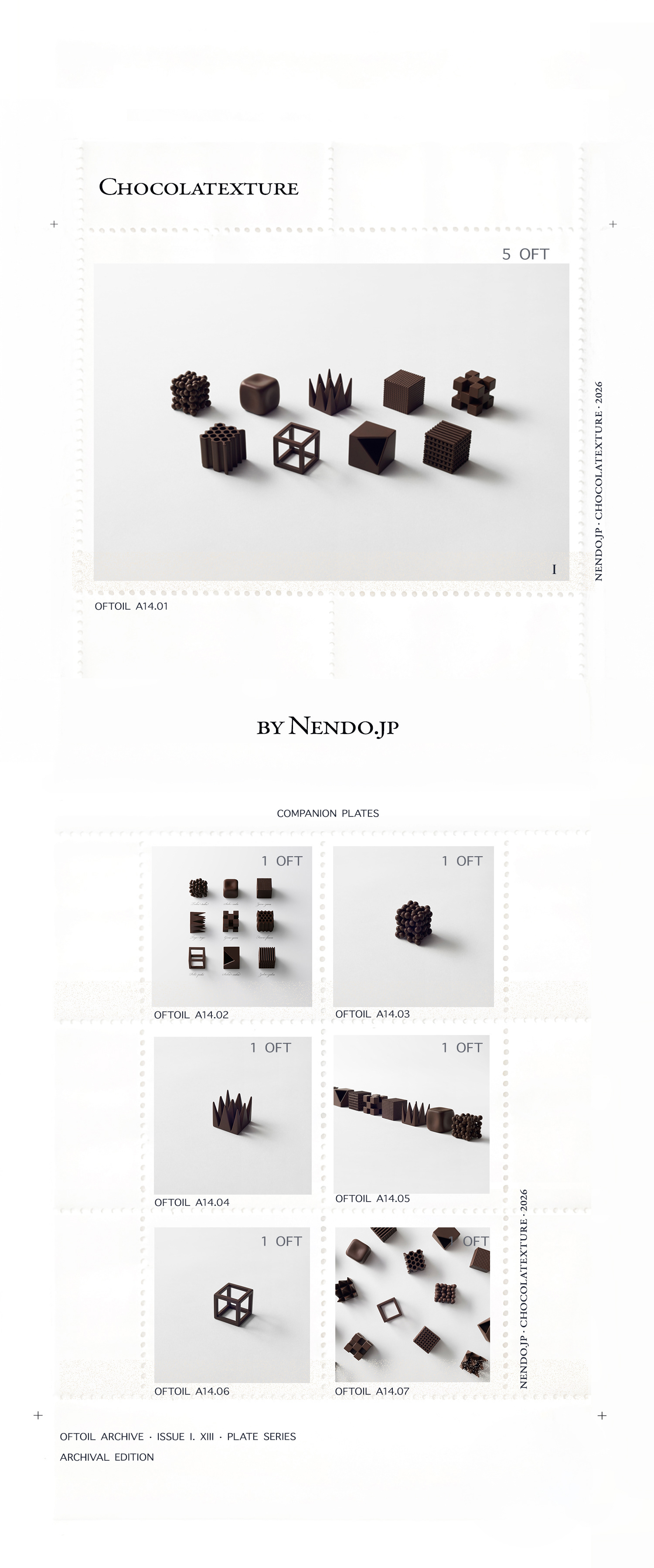
In coming up with a new chocolate concept, we turned out attention not to such factors, but to the chocolate’s “shape.”
The 9 different types of chocolate are made within the same size, 26x26x26mm,
featuring pointed tips, hollow interiors, smooth or rough surface textures–
and, while the raw materials are identical, the distinctive textures create different tastes.
featuring pointed tips, hollow interiors, smooth or rough surface textures–
and, while the raw materials are identical, the distinctive textures create different tastes.
Each chocolate is directly named after Japanese expressions used to describe texture.
1. “tubu-tubu” Chunks of smaller chocolate drops.
2. “sube-sube” Smooth edges and corners.
3. “zara-zara” Granular like a file.
4. “toge-toge” Sharp pointed tips.
5. “goro-goro” Fourteen connected small cubes.
6. “fuwa-fuwa” Soft and airy with many tiny holes.
7. “poki-poki” A cube frame made of chocolate sticks.
8. “suka-suka” A hollow cube with thin walls.
9. “zaku-zaku” Alternately placed thin chocolate rods forming a cube.
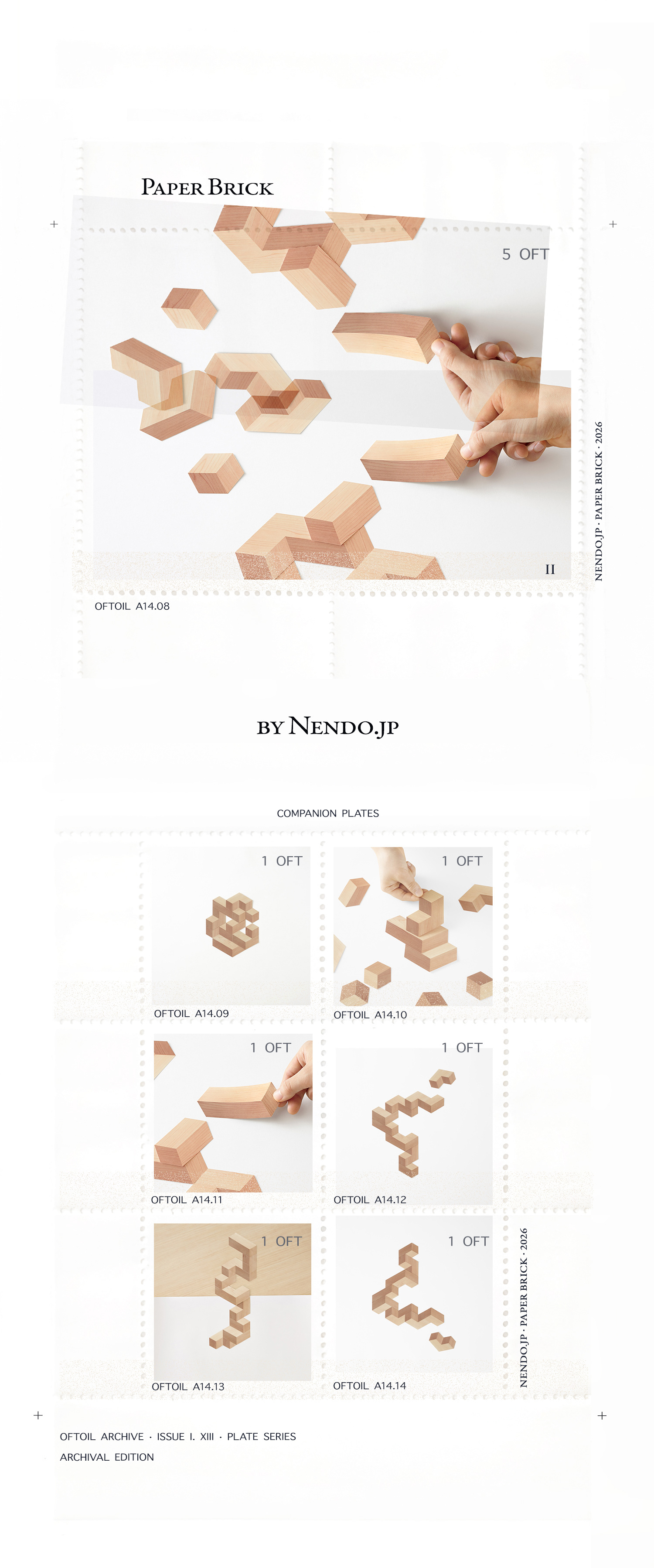
A set of paper blocks designed for an insert in Japanese lifestyle magazine Pen. Readers can create a pseudo-3D object by stacking tricolor blocks that seem three-dimensional. There’s no danger the blocks will collapse, so it’s possible to make ‘impossible’ forms that defy gravity and play with shade and perspective. Paper-brick can also be enjoyed as a puzzle: if put together carefully, the blocks stack into one large cube. 3D-CAD is about creating virtual three -dimensional forms on a two-dimensional screen surface. This toy aims to translate the concept of 3D-CAD into analog form.
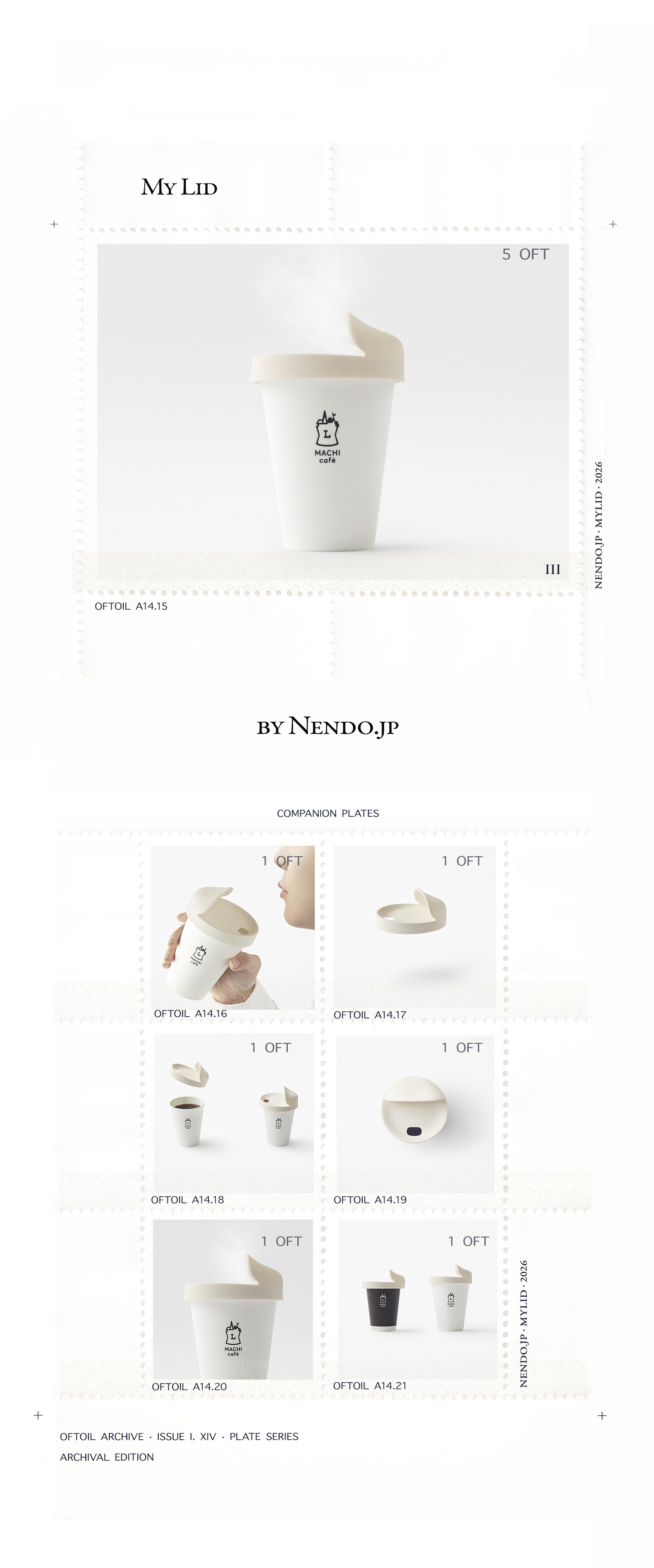
Out of concern for the environment, many restaurants have done away with disposable straws and plastic cups, and the use of paper cups, paper straws, and reusable metal straws is on the rise.
It is under such circumstances that the reusable coffee cup lid was designed for convenience store chain Lawson.
The coffee cup lid is indispensable in takeout, and not only does its reuse reduce plastic waste, this particular lid’s design allows for greater enjoyment of the coffee drinker.
Its main feature is the partially domed space on the opposite side of the lip. The coffee’s aroma rises through ventilation holes and is briefly captured beneath the shell, to be enjoyed with the coffee’s flavor, as intended.
The lid is double grooved on the inner side to grip and seal the rims of cups in the two sizes provided by Lawson.
It is made of silicone rubber, a heat-resistant and hygienic reusable material.
A special case for carrying the lid was designed with wide opening not only for easy access to the lid, but to hold the entire cup in two sizes, serving also as a sleeve while the coffee is being imbibed. Tyvek, a water-resistant nonwoven polyethylene fabric with low environmental impact, makes the pouch washable and capable of housing the portable lid in a hygienic state.
The project aims to reduce the disposal of the approximately 1 billion plastic coffee lids, equivalent to 2,000 tons of plastic, provided annually at convenience stores.
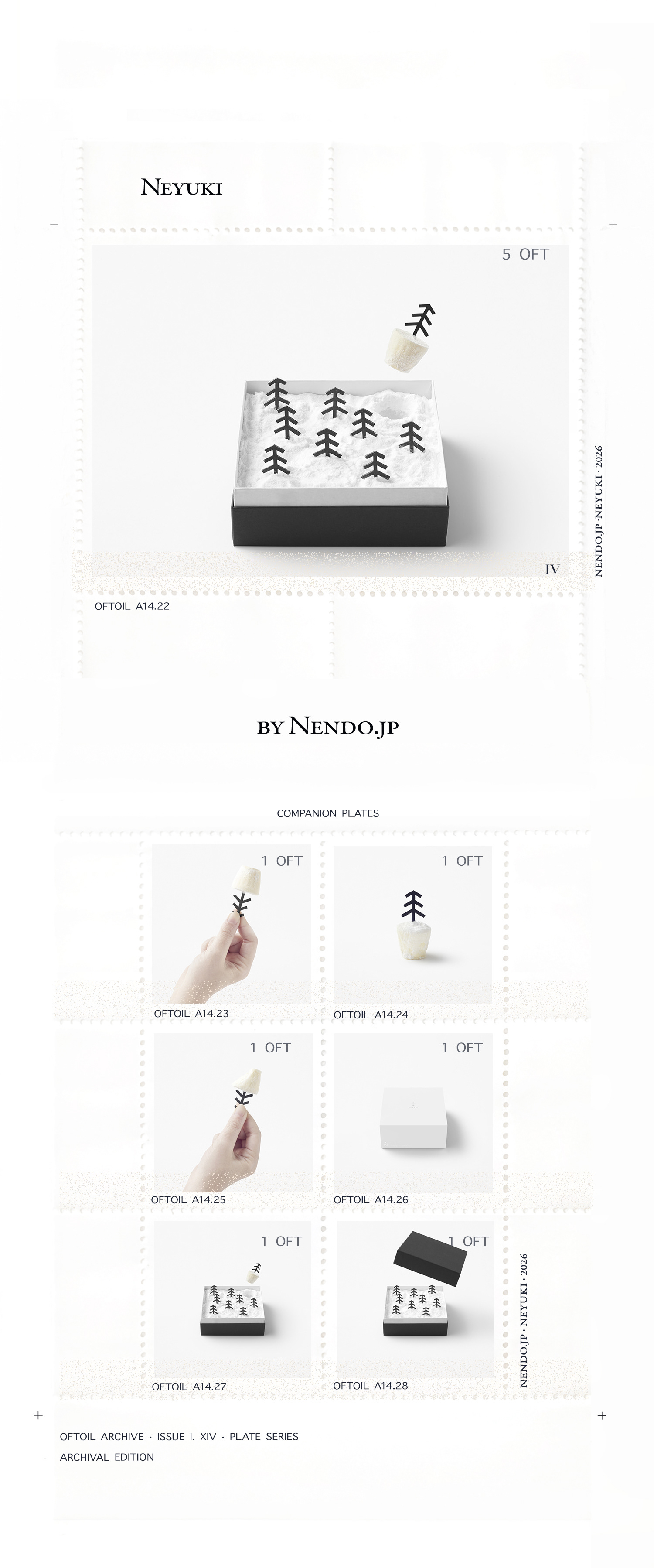
A branding and a new product design project for Flanders, Co. Ltd. a firm based in Kushiro, Hokkaido that specializes in manufacturing and selling of confectioneries. Hokkaido is located in the north of Japan and is renowned for its dairy farming and the production of its milk and dairy products.
The brand was named “N” taken from the word “north” and the logo was kept to a minimal with just a triangle that points to this direction reflecting the firm’s expertise in making confectioneries using the ingredients of Hokkaido.
A cheese cake was decided as the brand’s first product to be designed. When the box is opened a snowy landscape reminiscent of Hokkaido is presented, and when the tree is pulled out a cheesecake appears from beneath the snow.
The “snow” is made from icing sugar, and the “tree” can be picked up like a cocktail stick. The idea was inspired by the traditional techniques of the north that by storing vegetables and fruit in the snow a self-preservation occurs that enhances sweetness intensity.
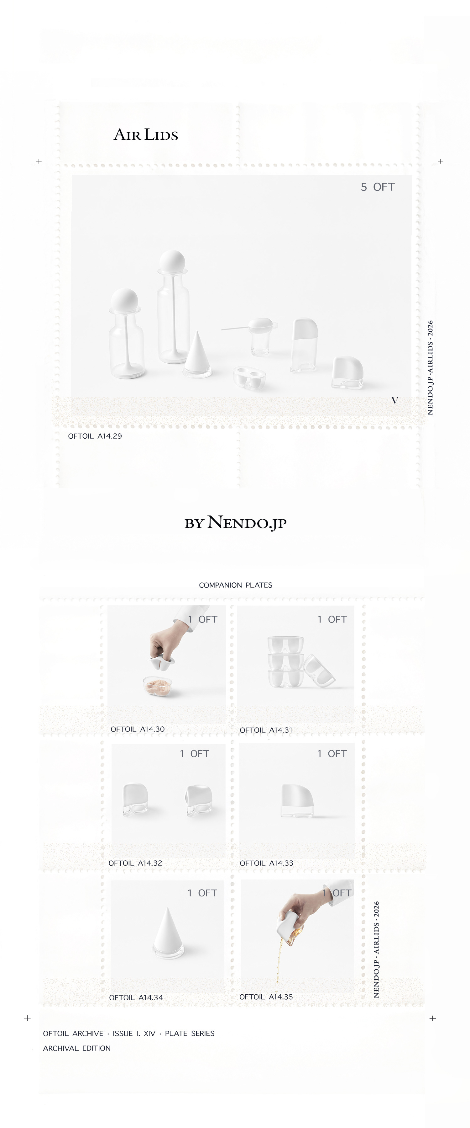
A kitchenware collection focusing on different lid designs in collaboration with Daikin, an air conditioning equipment manufacturer.
Daikin produces fluoroelastomer which is made from the same raw material that makes substances used in its air conditioning systems. Fluoroelastomer is a high- performance rubber which is commonly used in the automotive industry. This material has outstanding heat, oil and acid resistance and excels in preventing changes in color and shape over a long period of time.
This fluoroelastoemer, which is made from the same raw materials that assist in supplying pleasant air to people, has a silkier touch than regular silicone rubber, mimicking the same “airy” quality as if directly touching something materialized from the air itself, which normally cannot be touched. In order to best express the material’s characteristics and properties, a variety of functional kitchenware lids were designed each showcasing different possibilities.
01. Pick-up lid – a lid that can pick up together with seasonings from its container
02. Press lid – a lid for a liquid container that opens like a mouth when pressing down its top
03. Pinch lid – a lid that conceals a small spoon, which only appears when pinching its edge
04. Pull lid – a lid that is stretched from inside the container, closes its mouth with tension
05. Push lid – a lid that extrudes liquid from the container when being pushed in to it
These lid designs aim to symbolize “something” between human and an object, and to convey the abstract feeling of air to be a bit more tangible, which in reality we cannot really “sense”.
Images and words courtesy of Nendo studio.