“The most important thing in the Olympic Games is not to win but to take part…
the essential thing in life is not conquering but fighting well.”
The Olympic Games unfold as a recurring global ritual—an event measured not only in performance, but in symbol. Every iteration produces a language of its own: marks, emblems, posters, and systems of identity designed to hold a moment in time. These graphics do more than announce competition; they construct a visual memory of place, politics, and aspiration.
From the geometric clarity of 1980 Summer Olympics to the vibrant abstraction of 1968 Summer Olympics and the restrained precision of 1980 Winter Olympics, each identity reflects a distinct cultural atmosphere.
Lines, grids, and symbols become vessels for national expression, distilled into forms that must be instantly recognizable and endlessly reproducible.
Across these plates, the Olympic image emerges as a system of signs—disciplined, symbolic, and enduring. What remains is not the outcome of the games themselves, but their imprint: a collection of visual artifacts that continue to circulate, long after the events have passed.
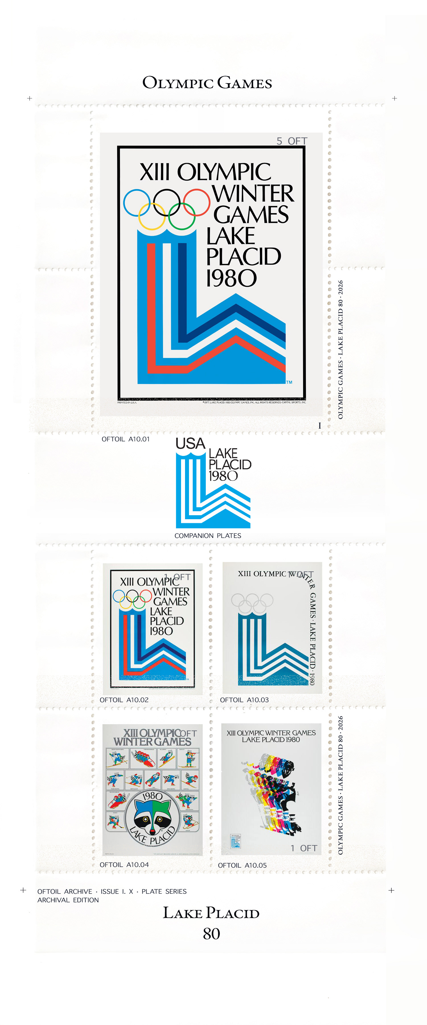
The chevrons on the right represent the mountains around the Olympic region. These join the vertical lines of the modified ionic column on the left, which recalls the predecessors of the modern Olympic Games. The serration on the top of the column turns into the Olympic rings, making them look as if they are emerging from the top. This serration symbolizes a double Olympic cauldron, to commemorate the Games already held in Lake Placid in 1932.
Poster
It features the official emblem representing a mountain and a double Olympic cauldron, commemorating the Games already held in Lake Placid in 1932.
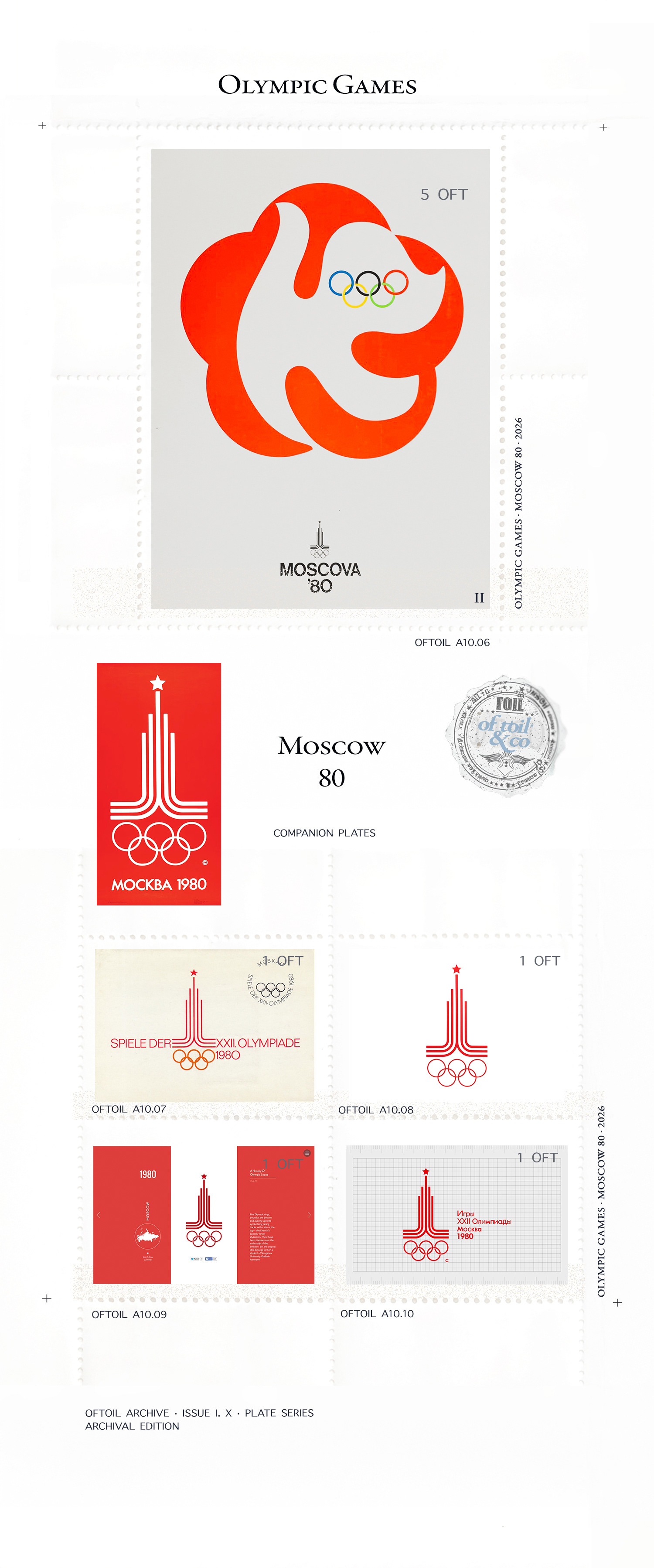
The official emblem was created by Vladimir Arsentyev. Above the Olympic rings, we find parallel lines in the shape of a pyramid and a five pointed star, which serves as a reminder of the flag of the Kremlin.
Poster
It featured the emblem of the 1980 Olympic Games in Moscow: a section of a running track rising into an architectural silhouette typical of Moscow and a five-pointed star topping the silhouette.
Emblem
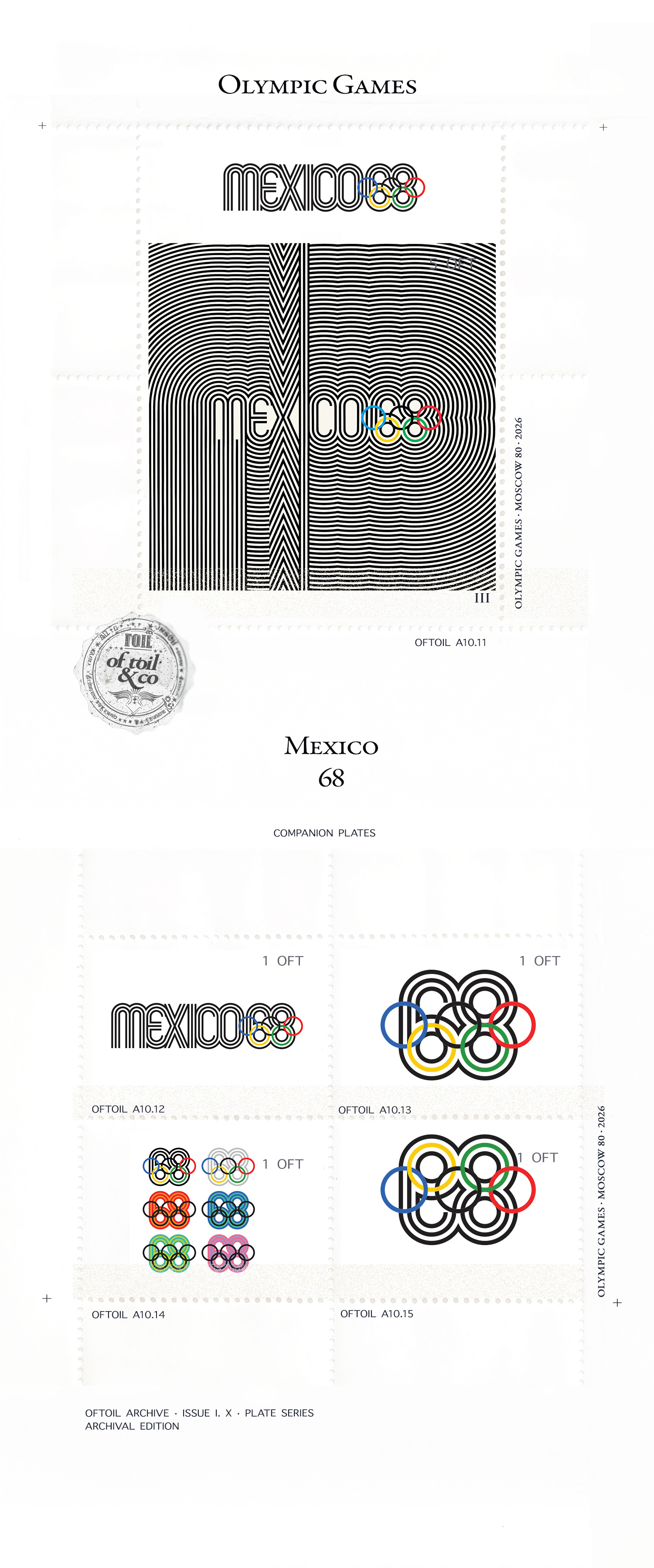
It is a combination of the five Olympic rings and the year. The design came from the collaboration of three artists: Pedro Ramirez Vazquez, architect and President of the Organising Committee for the Games, Eduardo Terrazas (MEX) and Lance Wyman (USA). It recalls the patterns of the Huichol, an Indigenous people of Mexico.
Poster
The series of posters for these Games came from the collaboration of three artists: Pedro Ramirez Vazquez, architect and President of the Organising Committee for the Games, Eduardo Terrazas (MEX) and Lance Wyman (USA) who designed the “Mexico 68” logo. They then developed it to create the black and white poster, which recalls the patterns of the Huichol. Some 25,000 copies of the poster presented were produced in one of the following colours: blue, red, yellow, green or black. A total of 1,591,000 posters were produced on the following themes: 18 sports posters, 287,000 copies; 19 cultural posters, 190,500 copies; 99 posters of various topics, 1,114,000 copies.
Mexico 1968 : The First Global Look
Born from the imagination of Pedro Ramírez Vázquez, the Mexico City 1968 Games emblem reflected the fashion of the time: hippy psychedelia.
Words & Images courtesy of the Olympic Games Committee and respective designers.